

ODOO Pricing Page Redesign
My Role
Key Skills
Tools
Timeline
Product Designer
User research, UX audit, informational architecture, user flows, wireframing, prototyping, usability testing, pitch deck presentation
July - August 2022


SUMMARY
Through Springboard’s IDP program, I was offered the opportunity to do a 7 week internship with WANDR Studio. WANDR is a UX Design agency that has done work for many large clients and companies.
We were tasked to find a site or app that we could find a design challenge to work on for the duration of our internship. This is how it went.
PROJECT
Design Challenge Problem:
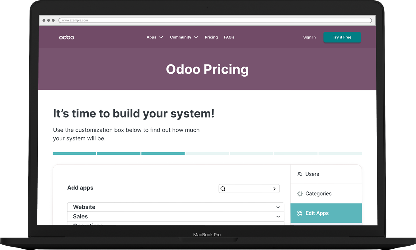
The problem is how to present the pricing page information in a more organized way and create a user flow that is simple and easy to use, encouraging the user to make the most of different business apps available to them.

RESEARCH PROCESS
RESEARCH QUESTION
What is the best way to present product price and information to users that is easier for them to digest?
OBJECTIVES
to find out how users understand and analyze a pricing page.
to understand user behavior when navigating different information in a pricing page.
PROCESS
Brand Information
Content Mapping
Competitive Analysis
Literary Research
Primary Research
User Interview
Usability Testing
BRAND INFORMATION
I went through the company’s website to get more information about the brand. I gathered as much information as I could and then listed them all down as the start of my research. I was also able to gather some information that helped me figure out how to categorize the different apps that were on the pricing page.
Odoo is a SAAS company that gives their users an opportunity to curate their own business systems by stringing together a variety of applications and tools that the company offers.
BRAND PERSONA
Someone you can trust to help you make complicated matters simple.
WHAT IS ODOO?
BRAND MISSION
“We think business software should cover complex needs without being complicated. Our mission is to provide software that is intuitive, full-featured, tightly integrated, effortless to upgrade, all while running smoothly for every business, every user.”
BRAND ATTRIBUTES
informative
systematic
friendly
easy
TARGET USERS
small business owners
entrepreneurs
large enterprises
COMPETITIVE ANALYSIS
I looked through various SAAS companies that offered a similar product, and reviewed their pricing pages. I looked at three main elements: pricing page design, getting more information, and customization of a system.

LITERARY RESEARCH
I was also able to pull up a few articles that helped validate the importance of the design of a pricing page. A study that was made by Profitwell was very useful in pulling insights for this project.
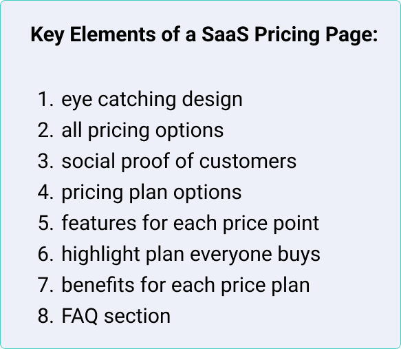
Another article on Webstack’s blog shared a few key elements that they believed were important in a SAAS Pricing Page:

UX Audit
After doing some research, we did a heuristic analysis of the product with a templated heuristic evaluation provided by WANDR to figure out what were the major or critical parts of the page that needed iteration.
Below are a few screens from the evaluation.


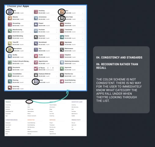
*I am working to improve the quality of these images.
PRIMARY RESEARCH: USER INTERVIEW/USABILITY TESTING
As time was limited for this project, we were assigned a Product Designer from WANDR to interview and do usability testing study with. Below are the findings based on the original pricing page of odoo.

INSIGHTS
Based on all the research above, I was able to come up with a few insights and how might we problem statements to start my design process.
the ability to understand what they are looking at.
an organized flow of information
ease of getting pricing information
ability to understand information given
... create a flow to allow the user to customize their system?
... provide information that is easy to digest?
... design a page that is organized and transparent in showing costs of the system.